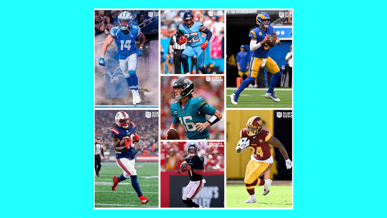
These redesigned NFL jerseys focus on the teams that need them the most – the Falcons, Lions, Jaguars, Patriots, Rams, Titans, and Commanders.
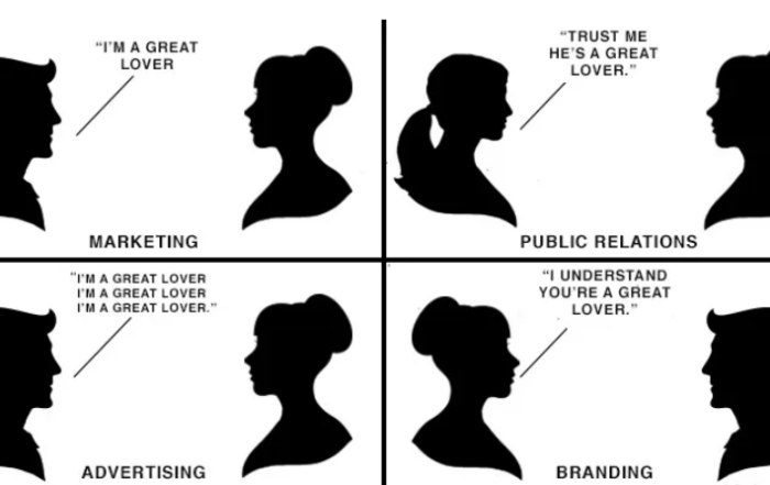
There is an inherent relationship between sports and branding. An expertly crafted on-brand uniform or jersey set captures the feelings and emotions of the fanbase. That ultimately captures their wallets and time, as well.
A well-done jersey or logo design will make non-fans of a team purchase their merchandise (like I did with the Miami Heat City Nights jerseys).
A poorly executed design will alienate fans and disconnect them from the ecommerce merchandise, but also the brand, in the form of not coming to games or buying stuff.
The phrase coined by Deion Sanders, “You look good, you feel good, you play good” extends to the audience. If a team doesn’t have a good product on the field, the brand design choices are panned, which makes it easier to dislike the product on the field.
This series is to show how some of the NFL’s uniforms could be improved with some tweaks if full re-designs and reverting to previous sets were off the table. Even the biggest brands in the world don’t always get everything right.
We partnered with designer Jonah Ward at Dubya Design to present his mocks below.
In these NFL concept jerseys, we will gradually “fix what’s broken” via some of the most popular NFL teams and roll out NFL uniform redesigns.
Think of these as NFL concept jerseys, where in some cases the NFL logos have even been re-imagined as well.
Let’s start with the Atlanta Falcons.
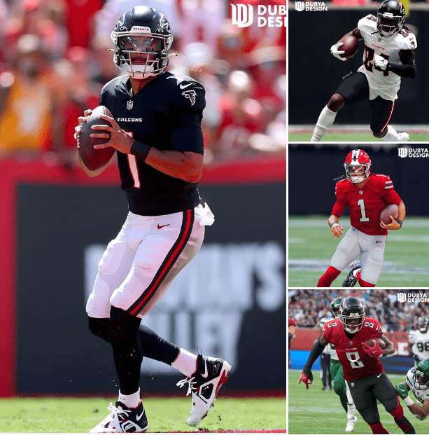
For the Falcons, after donning an outdated Reebok template for nearly 2 decades, they decided to switch things up.
Design Problem: Too many gimmicks were added. The Falcons can dramatically improve their look with some modifications that would make what they have now timeless.
What I added: In this redesigned NFL uniform, Atlanta and Falcons wordmarks rather than ATL, outlines on numbers, 1978 throwback uniform with the red shell, contrasting socks and pants (no more mono as primary looks.)
What I kept: The custom number font, silver/gray facemask (has a nice pop and matches logo accents), matte shell. No sock stripes, the Falcons haven’t worn them in about 45 years, it’s fine for some teams to not have them. Modern logo, it looks fine.
What I scrapped: Gradient from red jersey, unnecessary and limits combos to just one. Dropshadowed numbers, feel like a simple outline is cleaner in this case. Large ATL font on the chest, it’s oversized. Gold on throwback helmets, I prefer the 1978 throwbacks in this case.
Fixing What’s Broken: Detroit Lions
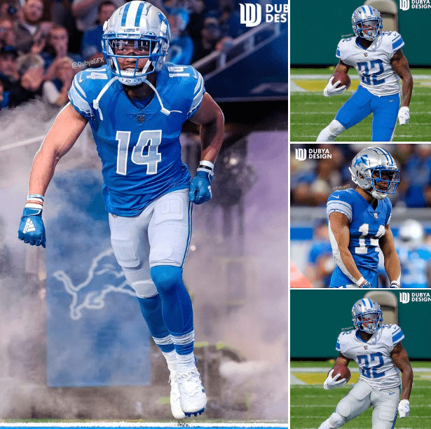
Design Problem: The Lions are a team who has opted to modernize a classic look after sticking with a look that had an unnecessary addition of black for arguably their darkest days as a franchise.
Their modern look is not horrible by any means, but could be a top uniform in the NFL if they were to make a few changes.
What I added: Blue facemask, much better. White middle helmet stripe, also filled in the gap with more of the blue stripe. Same width of modern helmet stripe but with the classic feel. Silver numbers and white outline, calling back to the early 80’s. I prefer the numbers like that because they match the sleeve stripes. Sock stripes, the Lions are an old team, they should have some traditional elements. Barry Sanders era alt uniform.
What I kept: Current font, looks modern, legible, and matches their wordmark. Current logo, it’s a modern version of the old one, no need for change.
What I scrapped: Sleeve ”LIONS” and ”WCF” memorial patch. They are redundant design elements that hurt the overall look. Gray Pajamas alt, most people despise it.
What does WCF stand for on Lions jersey? WCF is in honor of William Clay Ford, the Lions’ former owner who owned the team from 1963 until his death in 2014.
Fixing what’s broken: Jacksonville Jaguars
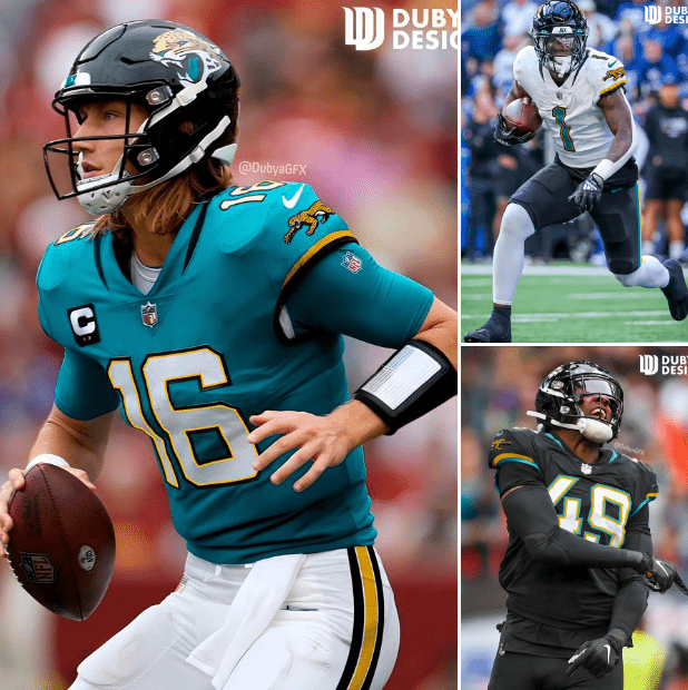
Design problem: The Jaguars have been through several redesigns over the last 15 years. Each redesign is lackluster but features several bright spots often overshadowed by missteps in the design. For the current redesign we see them go to a very plain minimal look after donning a look that was over the top, especially with a first-in-kind gradient lid.
What I added: Brought a double outline to the plain black and white numbers. This gives the uniform more depth. Gold trim. Pant stripes on all sets, no more yoga pants. Modernized prowling Jaguar logo on sleeve, fans would welcome this back.
What I kept: The new number font, it is simple and legible. Modern yet classic at the same time. Collar accents, simple detail that doesn’t go too far, it works. Plain socks, these uniforms are fine without them, as long as the sock and pant color are different.
What I scrapped: Leggings/unitard look. The socks and pant colors must be different so it doesn’t look like the team is wearing yoga pants. Stripes were added as well to deter this from happening. It is my biggest gripe on their uniform.
Fixing what’s broken: Los Angeles Rams
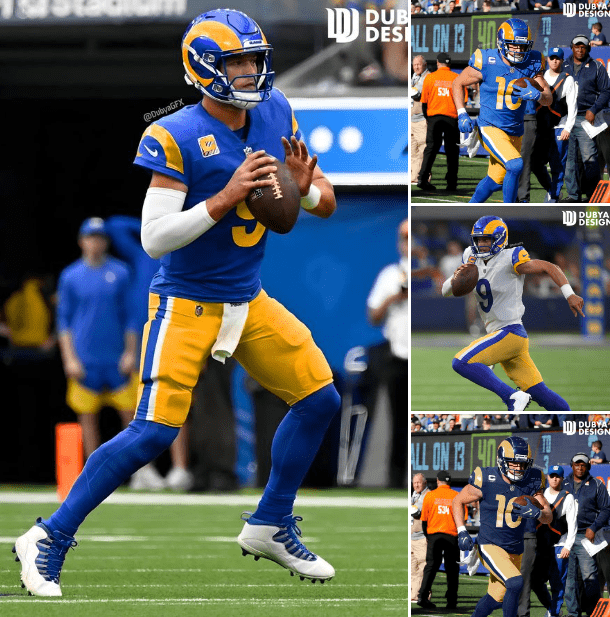
Design problem: For the Rams, they’re a franchise who wants to modernize and fit into the culture of LA, which is why they rebranded a few years ago. They dropped the navy and millennium gold from Saint Louis for a modified version of their classic colors featuring a brighter palette. To me, where this uniform falls short is in the gimmicks, they’ve put in some really distracting elements that feel amateur. If they had gone with something like I am showing here, I feel like the overall feedback to their rebrand would be better.
What I added: I connected the horns so it doesn’t look like two bananas or moons. I brought back the classic throwback gold
In place of the highlighter “sol.” In place of bone, a STL throwback, unique color scheme, would work for a one off if throwbacks weren’t on the table.
What I kept: The new blue and matching helmet shell, it works. The shape of the horn, the modern shape is much more circular compared to the classic horns, but it still looks like a Ram horn when it is connected. The pant stripes from the yellow pants, they are beautiful and classic-esque, a weird contrast to what they wear now. The number font, I am a fan of unique number fonts for teams, helps them stand apart.
What I scrapped: Bone uniform, do not need to elaborate. Any and all gradients, they hurt the uniforms look and are my biggest gripe. Disconnected horns. Best Buy employee name tag on the chest.
Fixing what’s broken: New England Patriots
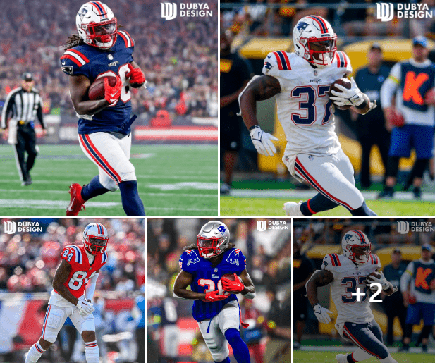
Design problem: The Patriots 0are a team who has rebranded after 2 decades in navy and silver getups that marked their entire era of dominance.
After Brady left, they switched up their primary uniforms to the color rush unis as well as an away version of it. They’ve also brought back their beloved classic throwbacks. In my updates, I want to bring them away from their Brady era completely and mesh in some of their classic elements that have been forgotten.
What I added: White helmets with classic stripes and white pants. 80’s styled stripes. I also added in their 90’s throwback as a reason to keep silver as the secondary helmet and as a fourth alt, I added an early 1990’s red facemask on the red uniforms because it contrasts nicely.
What I kept: Striped shoulders, current font, navy, white, red, and the flying Elvis logo.
What I scrapped: All traces of silver outside of the 1990’s throwback, silver was replaced with white. Mono home kit. Current tri-striping on uniforms. For some reason their away uniform stripes have always bothered my eyes, so adding the gap aleviates that as well as mimics their 80’s away kit. Current font on the throwbacks helmet bumper, I think the classic retro Pats font is cooler.
Fixing what’s broken: Tennessee Titans
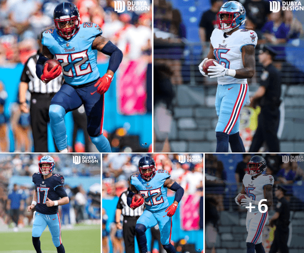
Design problem: The Titans rebranded 4-5 years ago. Their new look modernized a previous set and added a navy helmet for the first time in franchise history. They also added silver into their color scheme for the first time since the early 1970’s Oilers.
Their new look features a Greek-inspired font as well as sword accent. I personally don’t hate the current look, but would prefer a powder blue and red heavy look, like the Oilers. Let’s honor the franchise history and blend the modern Titans.
What I added: Color scheme has been swapped from Navy dominated to Oiler blue and red. About 1/4th of the league has navy in their colors, use the light blue to stand out. Red facemask, it pops. I brought in a 2nd shell that is Oiler blue, I think it would be a great addition outside of the obvious throwbacks. Classic pant striping but with the navy added. T logo back on the sleeves. Numbers have also been inverted, I think it was necessary if I wanted to use all of the red, light blue, and navy.
What I kept: The new number font, it’s modern and it fits the name Titans. Some people hate it, I don’t. The “thumbtack logo,” I’m doing a partial redesign here, not a full on rebrand, I’ve always liked it. The huge variety of uniform combos, I love how they mix and match, should definitely stick around with that color scheme. Plain socks, since I don’t have any shoulder and sleeve striping, it’s fine.
What I scrapped: All traces of silver, the Titans randomly added two shades of it, on top of the 4 other colors they already have. Shoulder and pant swords, cool in theory, too much in practice. Silver facemask, it doesn’t allow for the color scheme to shine. “Armpit stain” jersey accent, a lot of people find it unnecessary, me too.
Fixing what’s broken: Washington Commanders
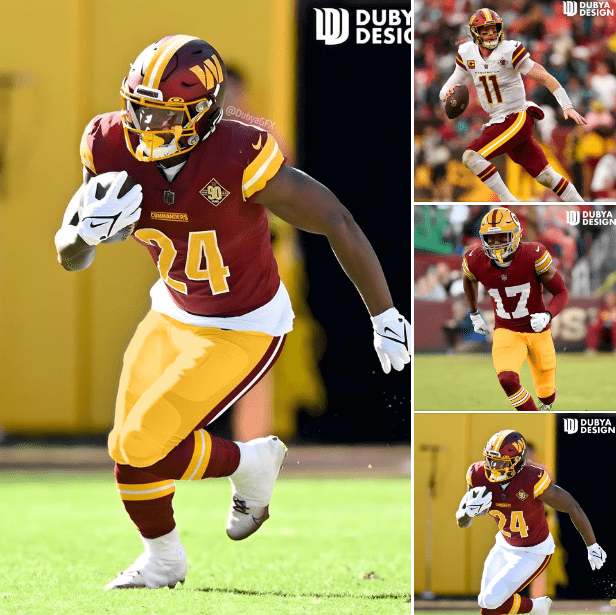
Design problem: Washington is a 90-year old+ franchise who has changed its longtime nickname and has abandoned their traditional look for a complete overhaul. There is a lot of history behind their previous looks and almost all of it was neglected when looking to the future.
What I added: Much needed pant and sock stripes to fill in the empty canvas that is half their uniform. Consistent striping. Helmet stripe now reflects the current jersey stripe. Yellow facemask, a staple of Washington’s uniform from 1978-2021. Yellow Pant option. Early 70’s throwback.
What I kept: The font itself for the home and away jersey. The new matte helmet. The W logo and wordmarks.
What I scrapped: Gradients on stripes and numbers, they hurt the overall design. Home jersey wordmark downsized so it’s no longer overpowering. All traces of black on the away uniform. No more alt-black uniform, throwback is a better option for a 90-year-old franchise.